
How might we help users do
more for less effort in settings?
The ideal settings UI will be well-organized, predictable, and contain a manageable number of options. Above all, it is important not to scare users on their first visit.
However, Touchwiz's settings UI was living in a safe zone for many years by keeping the commonly adopted, long-listed UI structure in the market. The issue was that the demands for better usability grew fast as smartphones evolved.
As for the GUI, it focused more on following the visual style guide of Samsung mobile, rather than optimizing it for the settings app context.
After intensive research and design iterations, we were able to deliver a completely overhauled interface which offers the simplest way to use the settings than ever before in the Samsung Galaxy series.
Touchwiz

NEW
Samsung Experience

Need for speed
Users visit the settings app when they cannot find what they want from the quick panel or settings in each application. Which means, usually, that they are not excited and want the job done as fast as they can do it with any other app.
Despite this, the Touchwiz settings UI overwhelmed users with a long list of features and vibrant colors for many years. This often scared users on their first visit.
It often distracted users from quickly scanning the menu, lead them to scroll without understanding its structure and, eventually, making them leave the app without discovering it further.
To fix this issue, we proposed to deliver three core values for the new settings UI.
-
Quick Scan
-
Quick Access
-
Quick Support
HIGHLIGHTS | APPROACH
Maximize legibility
The visual elements of the settings and the apps list should be treated differently, as the usage contexts are different. In the settings, people tend to search for text, whereas for apps they try to find the app icons first.
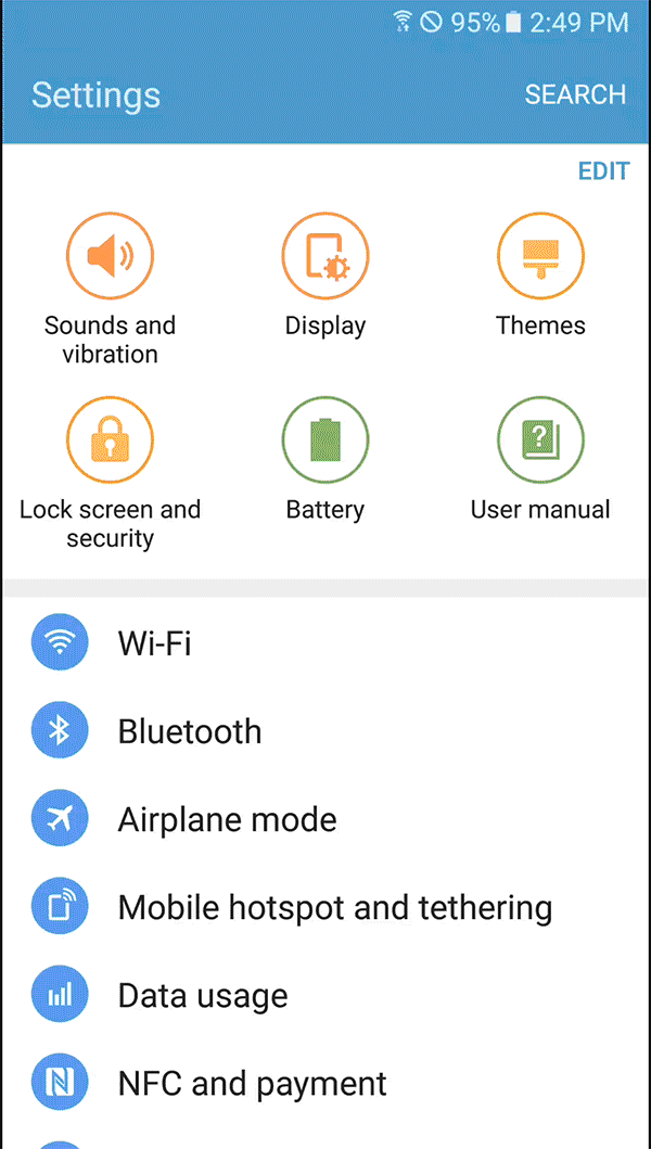
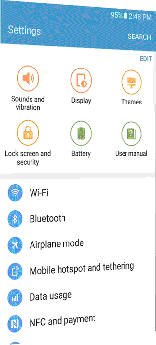
However, Touchwiz didn't take this into consideration. As we can see from the center image below, it used a colorful circular frame, similar to the apps list, but with a narrower line-height. This layout often distracted users from quickly identifying features because it formed a powerful vertical gaze-path between the icons.
Frameless icons to scan faster
Therefore, we removed the circular frames and increased the line-height to improve the legibility of each menu. Moreover, icons with different silhouettes worked better for identifying menus when scrolling through the list.
Apps icons

Setting icons with frames

NEW
Setting icons without frames

HIGHLIGHTS | QUICK SCAN
Uncluttered layout
The quick setting in Touchwiz was a feature for people who did not want to browse through the long list. The users could change the six default features on the top of the screen to whatever they wanted.
Despite the good intentions of the quick settings, according to the research (UIE 2011) less than 5% of users would change the default settings; as such, the feature merely took up half of the space, hiding five more features below the fold. Thus, for most users, it just increased the amount of scrolling.
Quick setting removed for better browsing
Moreover, its layout obstructed users from quickly scanning down the menu. The users had to switch their gaze path from horizontal to vertical while scrolling down. Consequently, this only made the Touchwiz settings feel complex from the first impression and we decided to remove the feature.
Touchwiz_ Quick Setting


HIGHLIGHTS | QUICK ACCESS
Touchwiz
32


44%
66%
display
before
scrolling
display
before
scrolling
Menus
16
Menus
2
Scroll
1
Scroll
Samsung Experience
Less but more
At least two scrolling actions were required in Touchwiz's settings to view the whole list.
However, this type of long list (a list of different features where people need to understand each menu before browsing further) was not intended for the settings. In fact, it works better for contents such as photos, videos, text, etc.
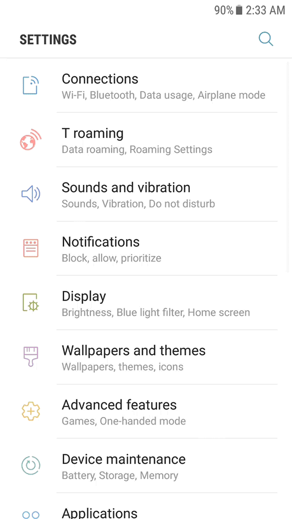
Restructuring the 1st depth for the faster overview
After a series of user tests and co-creation, we managed to cut the list in half, from 32 to 16 menus. To prevent the loss of information in the first level, we allocated representative sub-level features under each menu.
As a result, the users now can review 66% of the entire features without scrolling comparing to Touchwiz's 44%.
This change enabled the users to view the whole list with just a single scroll and instantly get a better understanding of the whole structure. This works even better when revisiting.
HIGHLIGHTS | QUICK ACCESS
Helps just in time
Relative links
Even if someone does get lost, we offer relative links at the end of each sub-menu to help them find what they might have been looking for.
The links were carefully chosen following the analysis of customer's voices from the user testings and on/offline VOC channels.


HIGHLIGHTS | QUICK ACCESS

List toggle button
Less depths
Instant toggle button
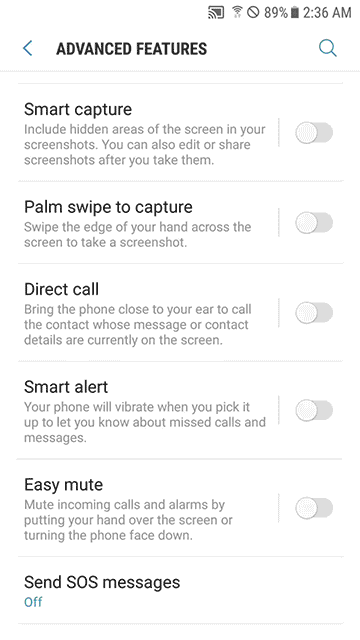
Using the toggle button on the list, the users can now set on/off without going into further depth for those sixty + α settings.
Contextual affordance
To help them make a decision without entering the list, we put "contextual information" under each heading. When disabled, it shows the description of the feature for better understanding, whereas when activated, it displays an “On” status. Still, the users can access details in the settings by tapping the left-hand side of the diver.
HIGHLIGHTS | QUICK ACCESS
SELECTED PRESS
“
The redesigned settings menu extends the simplified, functional theme further. It’s very hard to get lost in these settings [...]”
Vlad Savov | THE VERGE
“
An interface that seems much more refined than anything we've seen before from Samsung. That's most evident in the redesigned Settings app.”
Alex Dobie | ANDROID CENTRAL